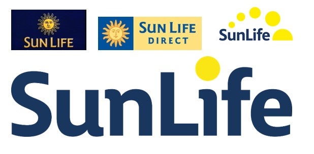
SunLife has announced a rebrand with a new logo, the latest in its 214-year history.
The in-house team at SunLife have simplified the logo with the rebrand, keeping its recognisable style and colours, but placing the name centre stage.
Go deeper with GlobalData

Furthermore, the yellow sunset has been lost to modernise the brand and improve digital accessibility to match its company ethos: Simple, Certain, SunLife.
Mark Screeton, CEO at SunLife, said: “We’re delighted to reveal our refreshed logo to the world and can’t wait to hear what our customers make of the change. At SunLife we’re all about keeping things simple, so that’s exactly what we’ve done, resulting in a clean, sharp new logo that is still recognisably us.
“It’s also of huge importance to us to be an inclusive and accessible brand, and our yellow circles weren’t meeting our high standards for accessible design on digital platforms. The new design is not only cleaner and free from low-contrast colour, but allows for the text itself to be larger within the same logo footprint.”
SunLife is a part of Phoenix Group, the UK’s largest long-term savings and retirement business.
It was the first company in the UK to offer life assurance without a medical, and has for many years been the UK’s most popular over 50s life insurance provider, according to the Association of British Insurers.